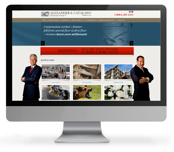
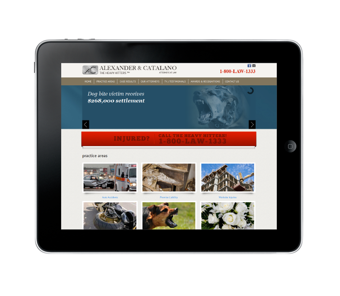
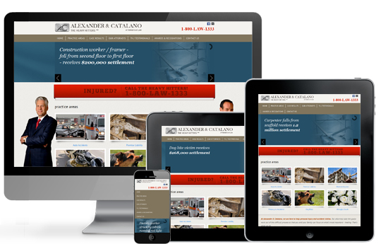
See the NEW AlexanderandCatalano.com
The Project:
Alexander & Catalano's original site was in a static framework. Although the original design was sound, the focus for the site had changed. It was decided that the practice areas and their case results were the priority. We also needed to address the current mobile trends and create a mobile friendly environment.
The Solution:
We needed to revamp the site design to target practice areas and case results. The home page became a navigational page. Instead of using it to introduce the firm, we created interactive images, designed to stand out from the background with a 3d paper effect, to drive the audience to specific practice areas. To better develop a relationship with specific attorneys we created direct links to attorney bios that carry throughout the site. A sitemap was added to the footer so that any page within the site could be accessible no matter where the visitor was.


