What is Responsive Mobile Web Design?
- Responsive Web Design - is the strategy that suggests design and development should respond to the user's behavior and environment based on screen size, platform and orientation.
- Adaptive Web Design - uses multiple page layouts for a single web page based on view port sizes.
- mDOT was the initial solution for mobile visitors to a website which customizes a unique experience for mobile users. Mobile users would be redirected to the m.dot version of the site and is usually a stripped-down version of the desktop site. This solution creates a duplicate copy of the site and forces two sets of code and design to be updated when changes are made. Providers who still suggest such a solution are many years behind in web technology standards.

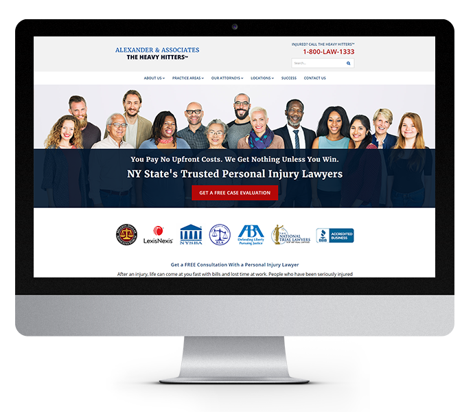
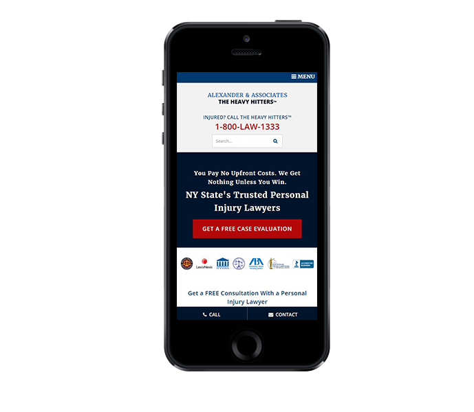
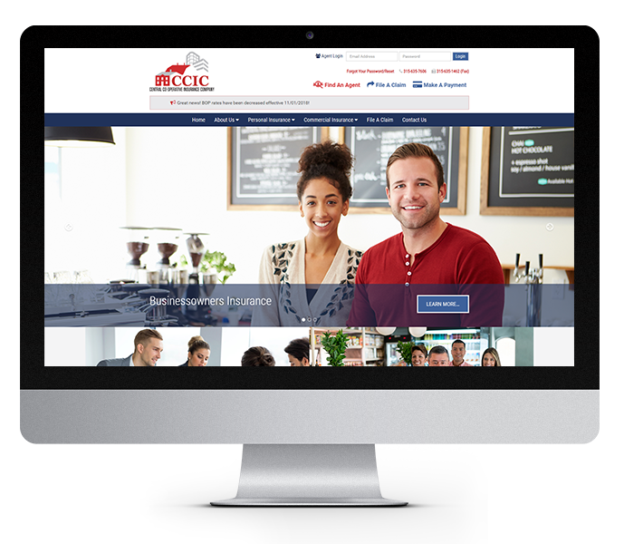
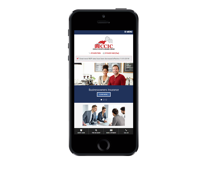
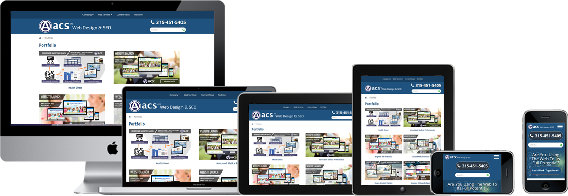
Leaders in Responsive Mobile Web Design, Syracuse, NY.
The web keeps changing and so do the people using it
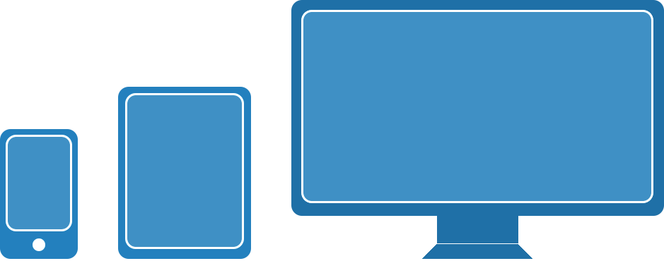
Smartphones and tablets have changed the way people interact with the web. We need to change our approach toward design and user experience if we're going to keep up. Before we needed to concern ourselves with were the different browsers (e.g. Internet Explorer, Mozilla Firefox, Google Chrome). Don't misunderstand that was hard enough and we still need to do that, but now with the explosion of Android and iPhones, iPad and iPad mini as well as the numerous android tablet devices we need to consider what your site looks like and how a user interacts with it in all these different environments too. That's where "responsive design" comes in.
What is "responsive design" and what does it mean to you?
320 x 480 px to 1920 x 1080 px
"Responsive Design" is a strategy of organizing and coding a website so that it creates an optimal experience in any device. A "Responsive Design" will literally reorganize itself based on the screen dimensions of the device it's being viewed so the same site can be seen on a desktop with a large screen and a mobile phone and even though it's still the same project, the user experience will change based on the needs of the visitor. Pretty neat huh?
Now that you understand what "responsive design" is we could explain how it works using media queries and CSS styles that engage and disengage on certain screen resolutions, but that's not as important as how "responsive design" can benefit you and meet your marketing and business needs.
Let's start with some statistics

Global Population (7.5 Billion+)
According to estimates by Statista, a statistics centered website, 68% of the global population has a smartphone, allowing internet access from a mobile device. The question is; are you reaching that audience?
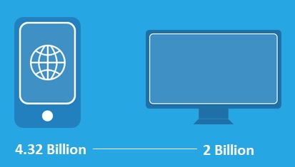
Smart Phones VS PC Desktops
As of January 2024, 55% of website traffic comes from mobile devices, such as phones and tablets. Additionally, 92% of people on who use the internet access the internet from their phone.
If you're worried about this, you're not alone. Just as companies realized, circa 1996, that they needed to create a website to remain relevant to consumers, history is repeating itself in mobile. The above statistics prove that more people are using phones than PCs to get online. Studies have also shown that consumers were spending more time on their mobile devices than on their PCs.
Why you should have a responsive website?
The “Responsive Design” concept is a tool, not a solution.
The "Responsive Design" concept is a tool not a solution. A professional designer can use this technique to create a web project for you that targets your audience, displays the information that a mobile audience is looking for and hide the information that isn't as important on a phone but is very important on a desktop or tablet environment. We will analyze your business needs and determine the objectives of each audience then present the visual elements so they make sense to a visitor no matter how they got to your website.