The Project:
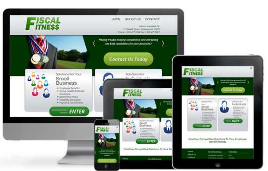
The original Fiscal Fitness site was built in a static framework and required third party technology installed on a visitor's computer to display and function properly. Of course we wanted to change that. It was determined that there were two equally important primary target audiences; small business owners and individuals. We also needed to account for current mobile trends and make sure the site was usable on a mobile device as well as a desktop computer.
The Solution:
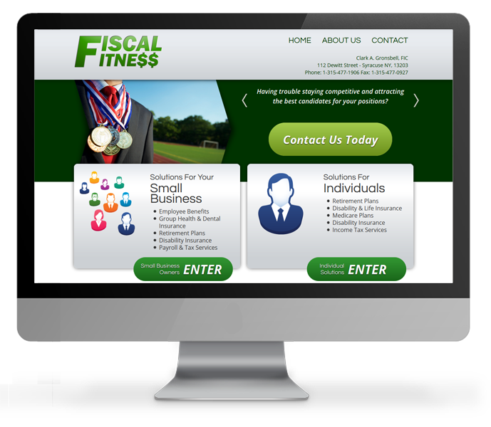
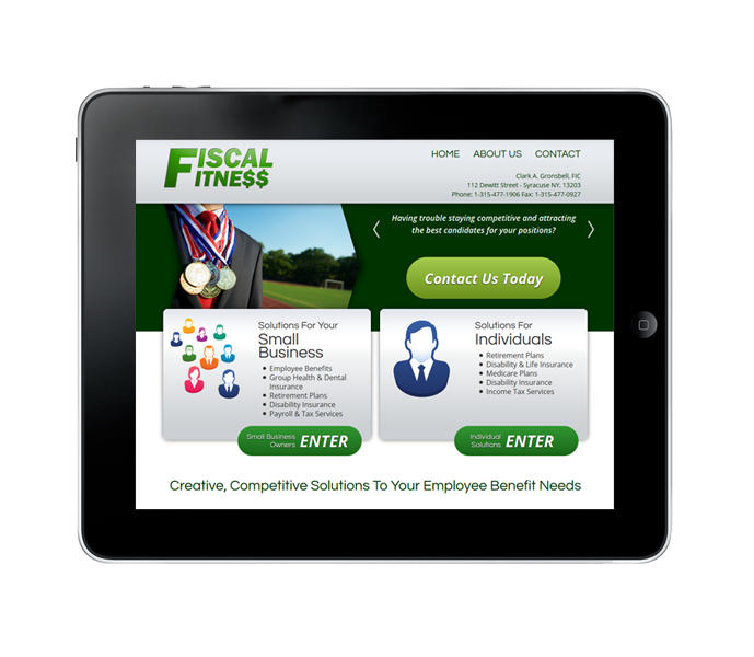
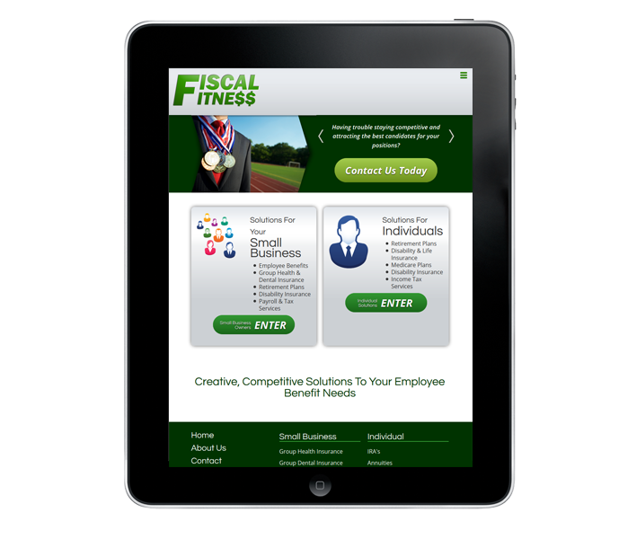
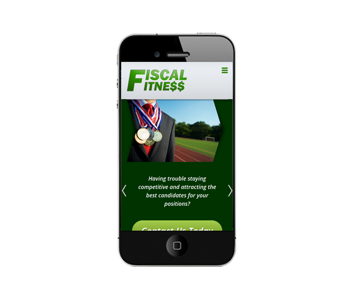
We removed the reliance on external software so the site could function on its own. To address the two target audiences, we created a portal experience for the homepage. This allows the visitor to determine the focus of the site that best relates to their specific needs. The site architecture and display is consistent between the two but the content and navigation changes to support the goals of the visitor. And of course, as is our practice on all new site projects, we built the website completely responsive.
Head over to our insurance portfolio page and immerse yourself in the excellence of our best insurance web design completed projects.

