The Project:
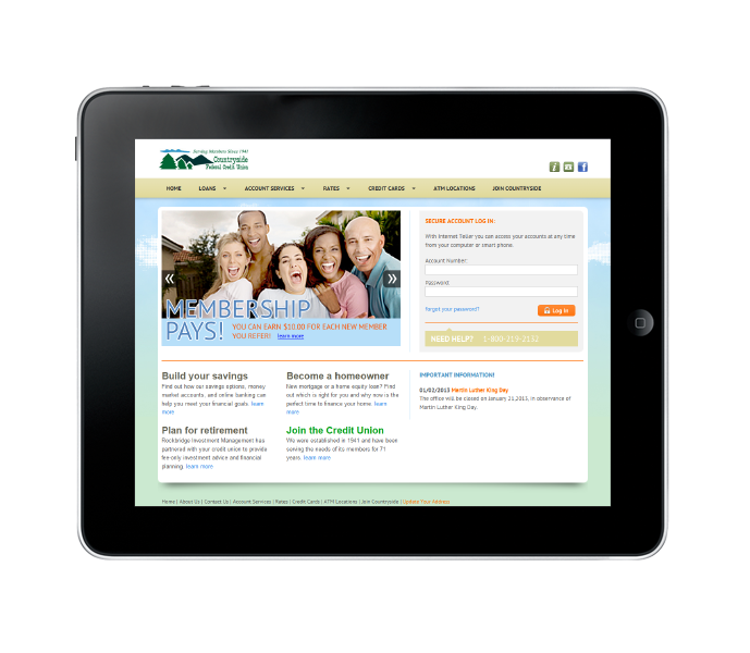
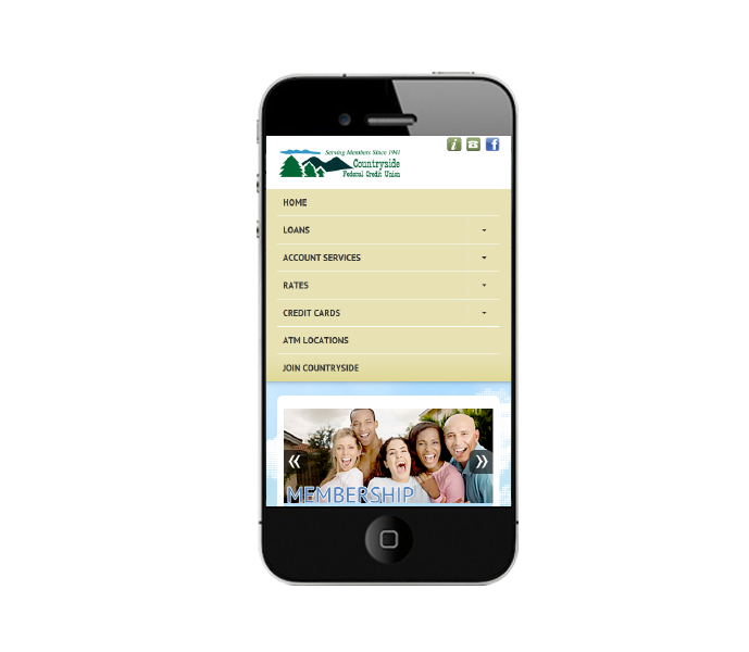
Countryside Federal Credit Union needed an updated website to meet the needs of their growing membership. They wanted to target a younger demographic without ostracizing their current member base.
The Solution:
Because the site was being used regularly we couldn’t completely reinvent the user experience or we’d run the risk of confusing the users who have expected a certain experience, but we did have to update the site for new audiences. We replaced the large homepage banner used to highlight the credit union and changed the focus of the site to offers and options available for both current members and potential members. We also themed the site trying to better brand the "Countryside" name.


