The Project:
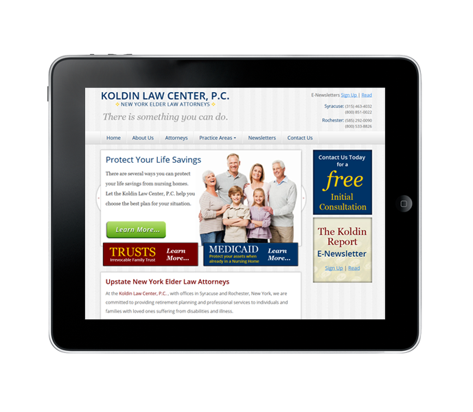
Koldin Law wanted a new look and feel for their site, something that would highlight their practice areas a little better while at the same time introducing a new design that could target a larger audience.
The Solution:
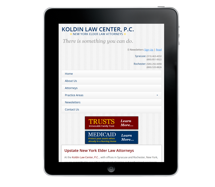
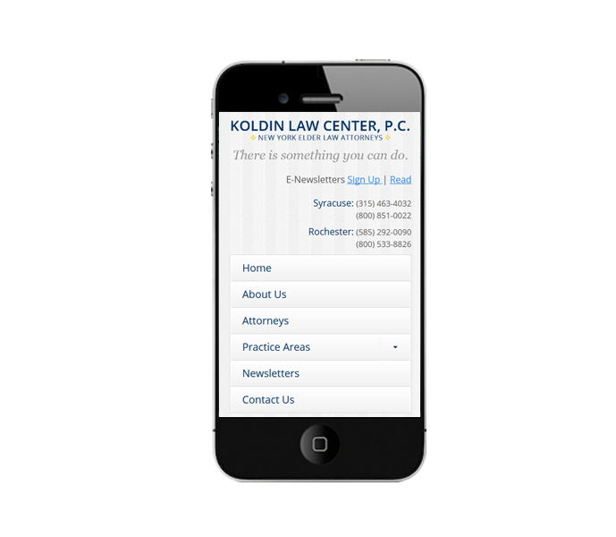
First we reorganized the structure of the content, making it easier for a visitor to find what their searching for. Once we had the sitemap we gave the site a "facelift" muting the background colors to better highlight content on the site. We then added a home page carousel to showcase their important practice areas with a link to those detail pages. To make the site accessible to tablets and phones we coded the new site within a responsive framework.


