The Project:
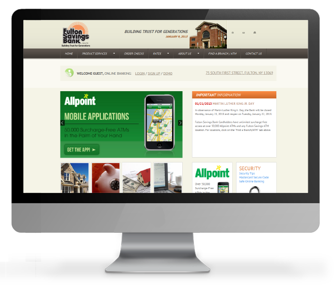
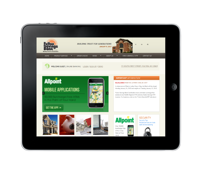
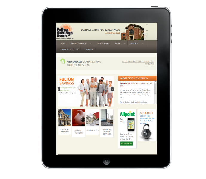
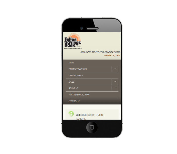
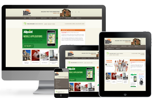
Fulton Savings Bank wanted to add value to their site and ease of use to their customers experience by creating a mobile optimized option for viewers who visited the site using mobile and tablet devices. At the same time, Fulton Savings Bank wanted to retain the exact same stable experience that desktop visitors had come to know and trust from the site. This made for an interesting challenge.
The Solution:
Using a proven responsive framework we rebuilt the site to reorganize itself as the screen size of the device changed. By keeping the exact functionality and layout their existing desktop visitors didn’t notice that the site was improved unless they viewed it from a mobile device. The purpose of this project was to future proof the site architecture. As new devices continue to be built and people interact with the web in new ways the new Fulton Savings Bank website will already be prepared for any display based eventuality, ensuring that site visitors can feel safe and secure when performing online banking and research tasks.

