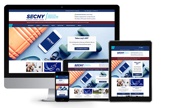
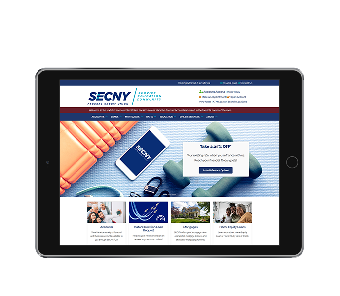
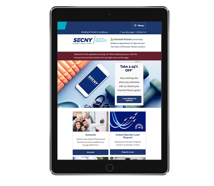
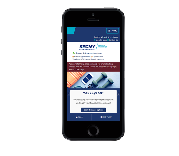
SECNY Federal Credit Union partnered with ACS Web Design & SEO for rebranding and redesign of their credit union website design. This collaboration aimed to refresh their online presence for updated brand consistency, and address the growing needs of their expanding membership base. With a new logo, an updated design, and additional functionality, the redesigned credit union website design offers a modern, user-friendly experience for members. This project also involved updates for the latest ADA website compliance regulations. SECNY's credit union website design also features a mega menu, presenting extensive services in a way that's easy for people to find what they need. SECNY’s goal was to create a seamless, accessible, and engaging experience for current and potential members.
Credit Union Website Design with Website Rebranding
![]()
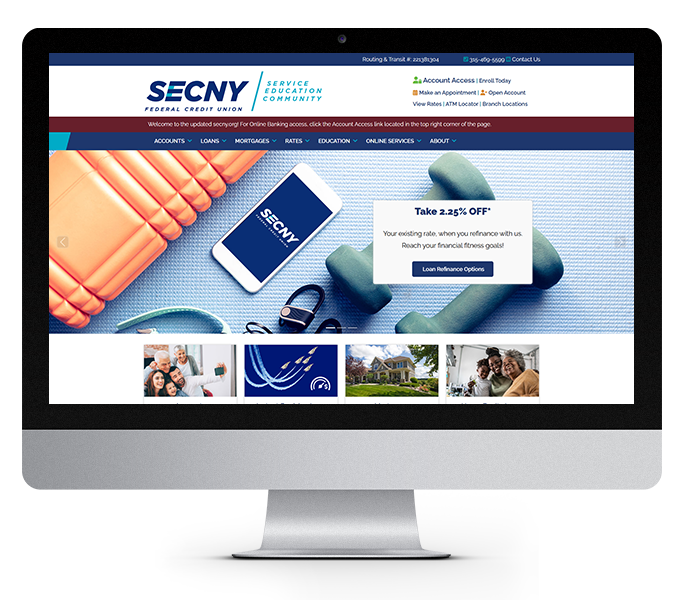
As part of the credit union website design project, SECNY FCU underwent a significant rebranding to better reflect its mission and values. Central to this rebrand was the introduction of a new logo and color scheme that embodies the core principles of service, education, and community. The updated logo features a modern, streamlined design that emphasizes SECNY's commitment to providing exceptional service to its members while also supporting the educational growth of the communities it serves.
The incorporation of the words “service,” “education,” and “community” into the logo aligns with the credit union’s core philosophy of empowering members through financial knowledge and local involvement.
The color palette was carefully chosen to reflect these values, with a blend of light and dark blues that symbolize trust, stability, and professionalism. Blue is a color long associated with reliability and security—traits that are crucial for any financial institution. The light blue offers a sense of openness and approachability, while the dark blue conveys confidence and stability. Together, these shades not only create a visually appealing and cohesive brand but also help reinforce SECNY’s image as a dependable, community-driven organization that is always ready to serve its members.
This rebranding project not only refreshed SECNY’s visual identity but also reinforced its commitment to its members and their financial well-being. The updated logo and color scheme, combined with the credit union’s focus on service, education, and community, help to position SECNY as a modern and trusted institution that truly cares about the people it serves. This new look marks an exciting chapter for SECNY FCU as it continues to grow and expand its reach across Central New York.
Update your organization's online presence with a brand consistent, custom website design.