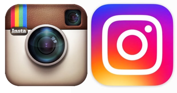
Instagram’s new logo design has quickly become a highly discussed topic.
Change has come to Instagram. The photo sharing social media network with over 300 million monthly active users has changed its recognizable logo, and the internet has mixed feelings about the branding change.
# 1 A Lot of People Don’t Like Instagram’s New Logo Design
Since Instagram revealed its new logo in the app’s May 11,2016 update, the logo design change has been criticized by some major publications. AdWeek, an established advertising industry news publication, published its take on the new logo design with the headline “Instagram’s New Logo Is a Travesty. Can We Change It Back? Please?”
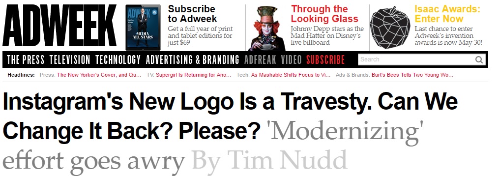
AdWeek was critical of Instagram’s new logo design.
Similarly, a May 11 New York Times article highlighted memes and other internet reactions that disapproved of the new Instagram logo.
# 2 Why A New Instagram Logo Design?
Instagram explained its logo design change as an attempt to “modernize” the app logo. “We landed on a glyph that still suggests a camera, but also sets the groundwork for years to come,” Instagram is quoted as stating in the aforementioned AdWeek report.
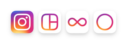
Instagram says their new logo is “inspired by the previous app icon, the new one represents a simpler camera and the rainbow lives on in gradient form.” They’ve also updated the logos for their other apps: Layout, Boomerang and Hyperlapse.
# 3 Where Instagram Went Wrong With Its New Logo Design
A common criticism of the new Instagram logo is that the change was unnecessary, a sentiment expressed in AdWeek’s article as well as across social media.
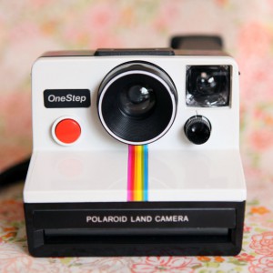
The original logo design was a nod to the Kodak Instamatic and Polaroid SX-70 cameras from the 1960s – 70s. It was simple, and it made sense. The new Instagram logo, as Maxwell Barna from the Huffington Post put it, looks like “Instagram’s logo went to Coachella and “found” itself.”
# 4 Instagram’s Logo Design Lesson
Knowing when a new logo design is needed is important to business growth. A logo should concisely and effectively visually communicate a business’ services and values. While both the old and new Instagram logo effectively communicate the app’s photo and video centric functionality, companies often need a new logo design and improved branding to best represent their organization.
An example of this was University Townhouses. University Townhouses provides housing for college students and young professionals in Syracuse, NY. Prior to partnering with ACS Web Design & SEO, University Townhouses lacked an identifiable logo. This made it more difficult for University Townhouses to be a memorable and available option for students searching for off-campus housing.
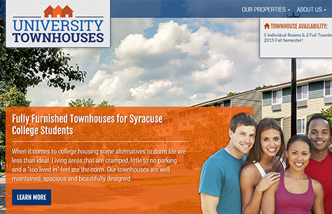
As part of a mobile-friendly website design project, ACS Web Design & SEO provided University Townhouses with a logo design and branding that effectively speaks to the company’s target audience of students and young professionals.
 Similarly, ACS Web Design & SEO provided a logo design and branding for Huron Creek Acres, a new brand and business offering outdoor recreation and lodging at a picturesque Upstate New York retreat. As part of a responsive website design project, ACS Web Design & SEO created the logo and branding for the new Huron Creek Acres. The logo visually communicates Huron Creek Acres services in an attractive and concise manner, providing Huron Creek Acres with an identifiable logo design and branding.
Talk With The Syracuse, NY Logo Design Professionals
For over 17 years, ACS Web Design & SEO has empowered businesses to use the web to its full potential with professional logo design services. Our professional designers create functional art that effectively represents your brand in all formats, both on the web and on all devices such as smart phones, tablets and desktops, as well as in print friendly formats.
To schedule a free professional evaluation of your online presence and logo design, contact us.
